
Project
While I was at Reading Plus I had the opportunity to lead a user interface project from start to finish to support the launch of our final product.
My job as an eLearning designer (senior graphic designer) was to transform a loosely organized library of product support documents into an official, streamlined, searchable, resource library. While my job was to design the actual documents, I sized the opportunity also design the delivery method - an internal help site that ended up being fully integrated with the main product.

Challenges
The first challenge was to create a site interface that was instinctual to interact with, as the primary target audience were grade school teachers with extremely varied relationships with technology.
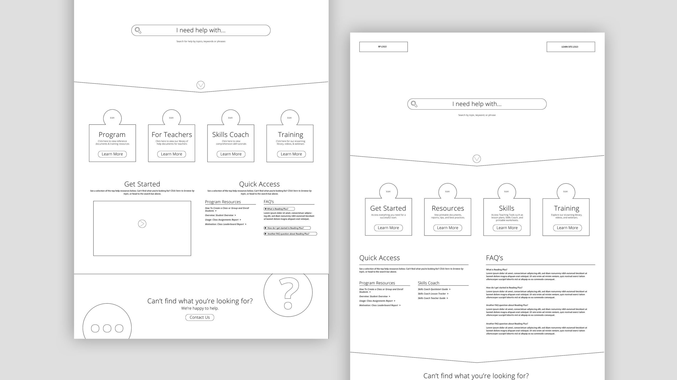
The second challenge was to create a homepage that served as a hub for various learning resources - both static and interactive - as well as for updates about the product.
The third challenge was to create an inner layout for static resources of which were constantly evolving and had subtle differences in the information delivered.
(were I able to manage which product assets to support with static resources, this would have been done quite differently.)
Solutions
The first solution:
I met with the customer service team and asked them which product aspects were the most challenging for users to use, and which aspects of product functionality were the most challenging to explain. From these conversations, I created a Quick Access panel that served up top resources based on user permissions (teacher, administrator, or district administrator).
Then, I added a large search bar, making it a central focus, at the top of the page.
Lastly, I added a clear call to action for contact information at the bottom in a contrasting color in case users got frustrated interacting with the platform, they could reach out for human assistance.
Solutions
The second solution:
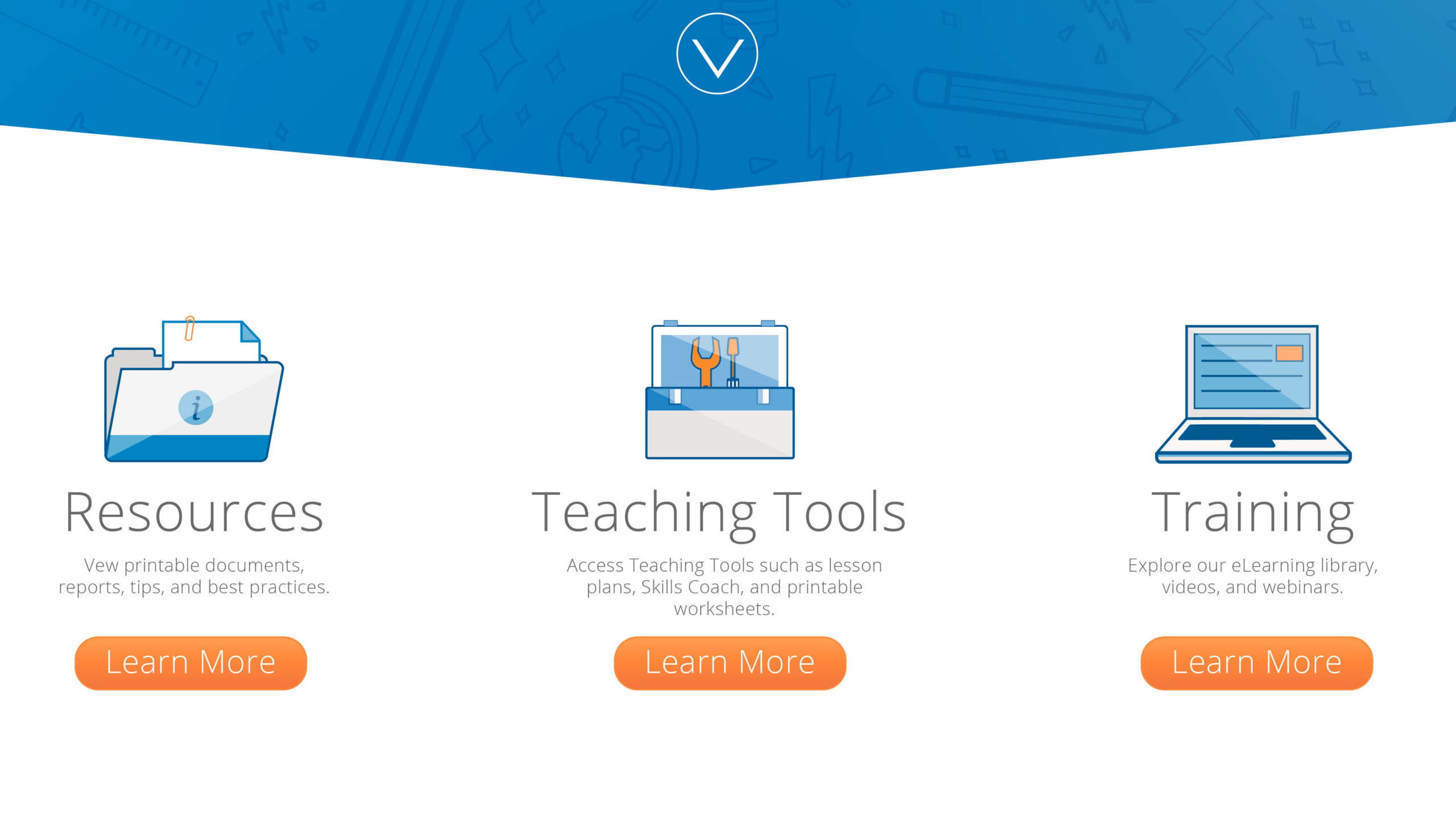
Was to create a clear second section with custom vector icons that that outlined the three categories of information a user could find on the website.
Solutions
The third solution:
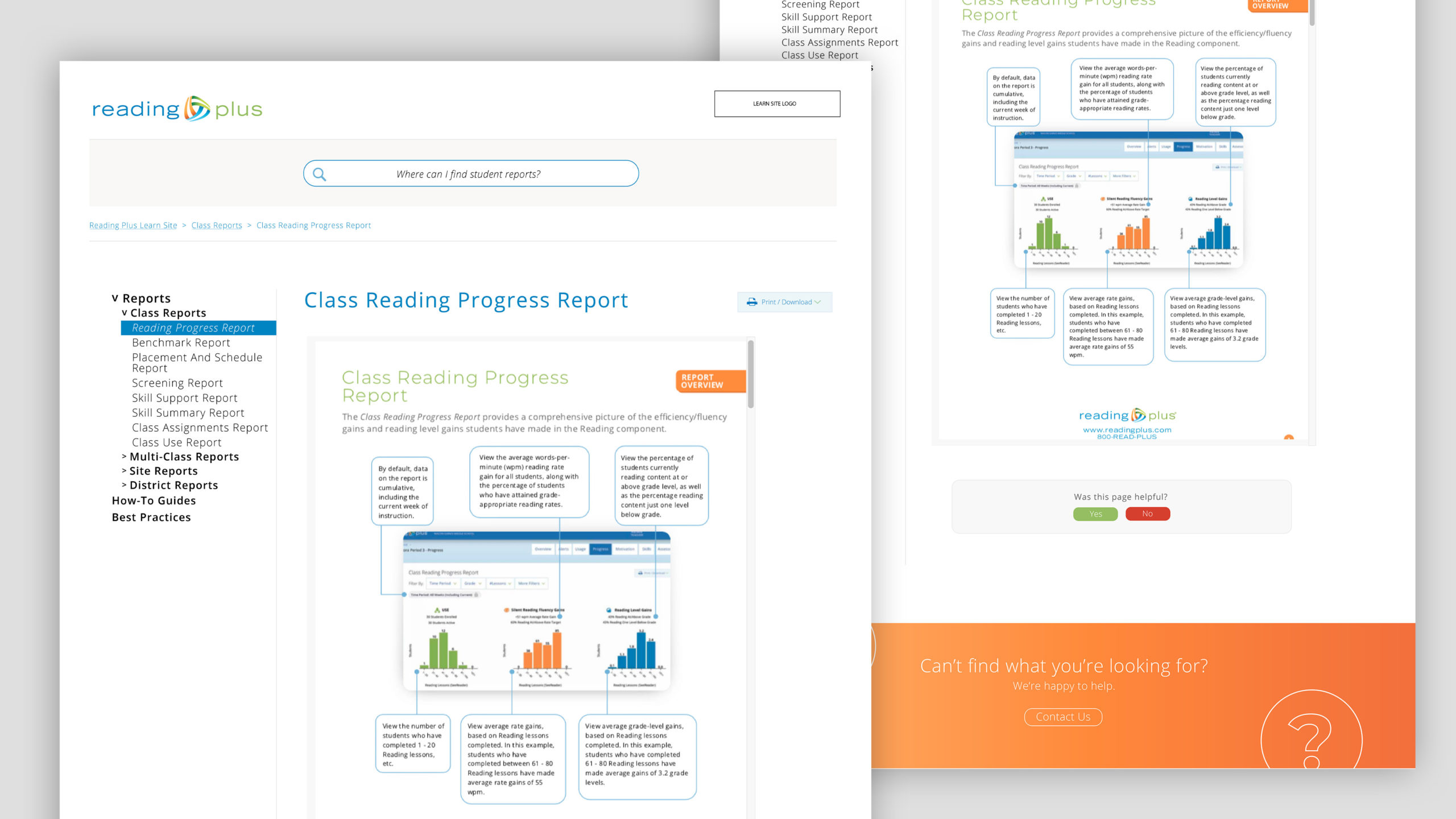
I designed the inner pages (post search) with a 'less is more' approach. Users are able to search for resources in two ways: Via the search bar, or manually through the Resources button on the home page.
The inner page navigation bar shows both a bread crumb trail at the top so users can see how they got to where they are, and also a hierarchy of information in a left page bar. The other 2/3 of the page displays a relevant static resource.
Either method of arrival allows users to see other resources that exist, not just for their original query, but also resources that pertain to certain sections of the product they may not know about or be curious about in an attempt to promote additional learning on the half of the user.
Final Product
Below is the final, functional product still in use today.
I provided the development team with an asset archive, and a guide with fonts, colors, and gradients used to facilitate ease on their side - they thanked me for my high level of organization...a trait I take immense pride in.